In the world of branding, every visual element plays a crucial role in shaping how an audience perceives a business. While colors and logos often receive the most attention, typography is equally powerful. The style of font you choose can influence emotions, trust, and even purchasing decisions.
Among the many font styles available, cursive fonts stand out for their unique ability to create a personal and human connection. But why do cursive fonts feel more intimate, and how do they impact branding?
This article explores the psychology behind font styles and explains why cursive typography can make a brand feel more authentic and approachable.
The Role of Typography in Branding
Typography is more than just selecting a font. It is a strategic decision that reflects a brand’s identity and voice.
A font communicates:
Tone (formal, casual, playful, elegant)
Personality (modern, traditional, creative)
Trustworthiness and professionalism
Target audience alignment
For example, a tech company might use clean and minimal fonts to appear modern and efficient, while a luxury brand may prefer elegant serif or cursive fonts to convey sophistication.
The key point is that fonts are not neutral. They send a message before a single word is read.
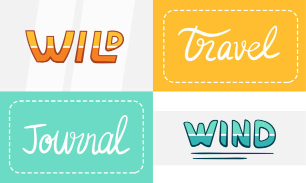
Understanding Cursive Fonts
Cursive fonts are designed to mimic handwritten text. They often include flowing strokes, connected letters, and stylistic curves that resemble natural handwriting.
Unlike rigid or geometric fonts, cursive typography feels:
Organic
Expressive
Personal
Creative
Because of these characteristics, cursive fonts are often used in industries where emotional connection matters, such as fashion, beauty, personal branding, and creative businesses.
Why Cursive Fonts Feel More Personal
1. Connection to Handwriting
Cursive fonts resemble the way people naturally write. This creates an immediate psychological link to human interaction.
Handwriting has long been associated with:
Personal letters
Signatures
Invitations
Artistic expression
When a brand uses cursive fonts, it subconsciously reminds users of these personal experiences, making the brand feel closer and more relatable.
2. Emotional and Human Appeal
Unlike standard fonts that can feel mechanical, cursive fonts introduce imperfection and flow, which are traits associated with human behavior.
This makes the brand appear:
More friendly
More authentic
Less corporate
For small businesses and personal brands, this emotional appeal can significantly increase audience trust.
3. Sense of Elegance and Creativity
Cursive typography often carries a sense of refinement and artistic value. This is why it is commonly used in:
Luxury branding
Wedding-related services
Beauty and fashion industries
Creative portfolios
The flowing nature of cursive fonts adds a layer of sophistication that is difficult to achieve with standard typefaces.
4. Strong Visual Identity
Cursive fonts are visually distinctive. Their curves and unique shapes make them more memorable compared to generic fonts.
A brand that uses cursive text effectively can:
Stand out from competitors
Build stronger brand recognition
Create a signature visual style
When to Use Cursive Fonts in Branding
Cursive fonts are powerful, but they should be used strategically. They work best in the following situations:
Ideal Use Cases
Logos and brand names
Taglines and slogans
Social media bios
Product packaging
Headings and highlights
Situations to Avoid
Long paragraphs (can reduce readability)
Highly technical content
Formal corporate communication
The goal is to enhance the message, not overwhelm it.
Balancing Cursive Fonts with Readability
One of the most common mistakes in branding is overusing decorative fonts. While cursive text looks appealing, it must remain readable.
Here are a few best practices:
Combine cursive fonts with simple fonts for body text
Use cursive for emphasis rather than entire content blocks
Choose clean and clear styles over overly complex ones
Test visibility across devices and platforms
A balanced approach ensures that your branding remains both attractive and functional.
Creating Cursive Text for Modern Branding
With the rise of digital platforms, brands no longer rely solely on designers to experiment with typography. Online tools now make it easy to generate stylish cursive text instantly.
For example, tools like Letras Cursivas allow users to convert standard text into multiple cursive styles that can be used across social media, websites, and branding materials.
This simplifies the process of:
Testing different styles
Creating unique text variations
Enhancing online presence without design expertise
Such tools are especially useful for content creators, marketers, and small business owners looking to build a distinct visual identity.
Final Thoughts
Font style is a powerful yet often underestimated element of branding. The right typography can influence how people perceive your brand, shaping emotions and building trust.
Cursive fonts, in particular, offer a unique advantage by introducing a human, personal, and expressive touch. They bridge the gap between digital communication and real human interaction, making brands feel more authentic and engaging.
However, like any design element, cursive typography should be used thoughtfully. When combined with clear structure and readability, it can become a defining feature of a strong and memorable brand identity.
By understanding the psychology behind font styles and applying them strategically, businesses can create a deeper connection with their audience and stand out in an increasingly competitive digital landscape.