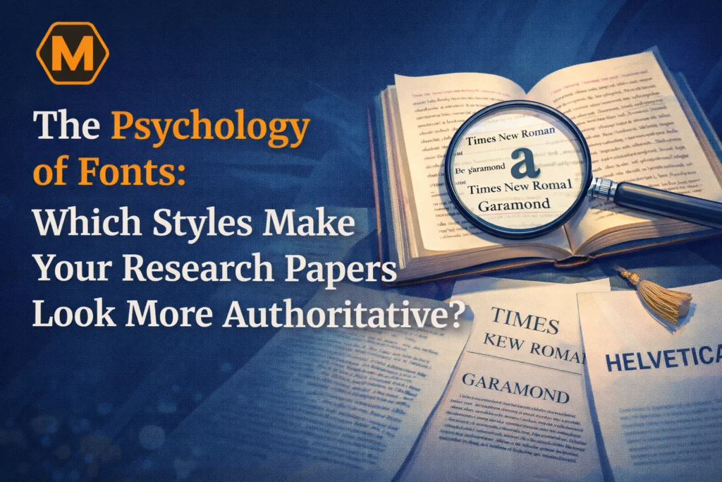
In the modern academic landscape of 2026, the "visual rhetoric" of a document is just as persuasive as the data it contains. When a professor or a peer reviewer opens your research paper, they are hit with a sensory experience before they process a single logical argument. This initial contact—the choice of typeface, the spacing of the lines, and the hierarchy of the headings—sets the stage for how your intellectual "voice" is perceived. In the field of typography psychology, certain font styles act as silent signals of credibility, tradition, and rigorous study. Selecting the wrong font doesn't just make a paper look "ugly"; it can actually increase the cognitive load on the reader, making your complex theories feel harder to understand and, therefore, less "true."
The challenge for many students is balancing this aesthetic precision with the sheer volume of research required for a high-level thesis. If the technical demands of formatting according to APA or MLA standards become a barrier to your creative output, seeking Assignment Help from a dedicated professional brand like myassignmenthelp can be a game-changer. By allowing experts to handle the structural and visual integrity of your document, you free up your mental energy to focus on the core discovery of your research. When your paper looks authoritative, your arguments carry more weight.
1. The "Baskerville Effect": The Science of Trust
One of the most famous experiments in the psychology of typography involved showing users the same statement in six different fonts: Baskerville, Computer Modern, Georgia, Helvetica, Arial, and Comic Sans. The results were staggering. Statements written in Baskerville—a high-contrast Serif font from the 18th century—were significantly more likely to be believed by the readers.
Why does this happen? Baskerville possesses a "formal" DNA. Its sharp serifs and vertical axis mimic the style of classical British printing. In the reader's subconscious, this font is associated with "The Establishment," "The News," and "The University." When you use a font with this level of historical baggage, you are essentially borrowing the authority of the institutions that have used it for centuries.
2. Serifs vs. Sans Serifs: The Battle for Legibility
In the academic world, the debate between Serif and Sans Serif fonts is more than just a matter of taste; it’s a matter of Legibility vs. Readability.
Serif Fonts (e.g., Times New Roman, Garamond, Georgia): These fonts have small decorative strokes (feet) at the end of their main strokes. These "feet" create a horizontal line that helps the eye move across a line of text more fluidly. This makes Serif fonts the superior choice for long-form, printed research papers where "Readability" over 20+ pages is the priority.
Sans Serif Fonts (e.g., Arial, Helvetica, Calibri): These lack the decorative feet and are often perceived as "cleaner" and more "modern." They have high "Legibility," meaning individual characters are very easy to distinguish. This makes them ideal for digital screens and short-form abstracts.
Comparative Typography Table
Font Category | Best Use Case | Psychological Perception | Academic Examples |
Traditional Serif | Printed Thesis, Dissertations | Established, Reliable, Expert | Times New Roman, Garamond |
Modern Serif | Research Proposals, Journals | Sophisticated, Precise, Sharp | Baskerville, Georgia |
Humanist Sans | Digital Reports, Presentations | Accessible, Clear, Direct | Calibri, Open Sans |
Grotesque Sans | Headings, Infographics | Objective, Bold, Modern | Helvetica, Arial |
3. The Psychology of "Cognitive Load"
"Cognitive Load" refers to the amount of mental effort being used in the working memory. If your research paper uses a font that is too tight, too decorative, or has poor kerning (the space between letters), the reader’s brain has to work harder just to "decode" the words.
When the brain struggles to decode text, it subconsciously transfers that feeling of "difficulty" onto the subject matter itself. If a professor finds your paper "hard to read," they will likely find your arguments "hard to follow." To maintain authority, your typography should be invisible. It should act as a transparent window through which your ideas can shine.
4. Visual Hierarchy: The Roadmap of Your Research
An authoritative paper is one that respects the reader's time. You do this by creating a clear visual hierarchy. In 2026, where digital skimming is the norm even in academia, your headings must tell the story of your paper.
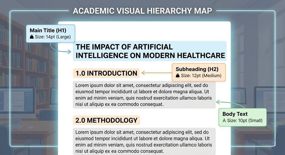
Weight Matters: Bold headings provide "anchors" for the eyes.
Size Scaling: A standard ratio for academic papers is the 1.2x scale. If your body text is 10pt, your subheadings should be 12pt, and your main titles should be 14pt or 16pt.
For students in technical fields like Computer Science, where documentation must be perfectly organized, having access to programming assignment help can ensure that code snippets and technical explanations are formatted with the precision that top-tier grading requires. This allows the student to maintain their reputation for excellence in complex subjects without getting bogged down by the minutiae of layout design.
5. The "Aesthetic" of Integrity: White Space and Margins
On a site like Aestheticfont.com, we often focus on the letters themselves. However, in a research paper, the space around the letters is just as important. In the psychology of design, "White Space" (or negative space) signifies luxury, calm, and confidence.
A paper that is "crammed" with text, featuring tiny margins and no paragraph breaks, signals anxiety and a lack of organization. To look authoritative, you must "let the paper breathe."
Standard Margins: Always use 1-inch (2.54cm) margins on all sides.
Paragraph Indentation: Use a consistent 0.5-inch indent for the first line of every paragraph.
Line Spacing: Double-spacing (2.0) is the standard for a reason—it allows for easier grading and note-taking by the reviewer.
6. Discipline-Specific Typography: Matching the Tone
Not all academic fields are the same, and your font choice should reflect the "vibe" of your discipline.
Law & History: These fields value tradition. Stick to high-contrast Serifs like Baskerville or Caslon.
STEM (Science, Tech, Engineering, Math): These fields value precision and modernity. A clean Sans Serif like Helvetica or a technical-looking Serif like Computer Modern (the LaTeX standard) works best.
Arts & Humanities: These fields value "The Human Touch." Garamond or Palatino are excellent because they have a classic, calligraphic feel.
Frequently Asked Questions
1. Why do serif fonts feel more authoritative in academic writing?
Serif fonts, characterized by the small decorative strokes at the ends of letters, are historically associated with traditional printing and established institutions. This long-standing connection creates a psychological perception of reliability, formality, and deep-rooted expertise in the reader's mind.
2. How does typography affect a reader's "Cognitive Load"?
When a font is difficult to read or poorly spaced, the brain must exert extra effort to decode the letters. This increased mental strain, or "Cognitive Load," can make complex research feel more confusing, leading the reader to subconsciously perceive the author’s arguments as less credible or poorly organized.
3. Is there a "most trusted" font for research papers?
Studies in typography psychology, such as those involving the "Baskerville Effect," suggest that high-contrast, classical serif fonts are often rated as the most believable. These styles command a level of professional respect that modern, rounded, or overly simplified fonts often fail to achieve in a scholarly context.
4. Can font choice really impact my final grade?
While a font cannot replace high-quality research, it significantly influences the grader’s "first impression." A clean, professional visual hierarchy reduces reader fatigue and signals that the student has a high attention to detail, which can positively frame how the actual content is evaluated.
About The Author
Harrison Walker is a seasoned Content Strategist and digital media expert at MyAssignmentHelp. With a deep background in communication and design, Harrison focuses on the psychological impact of digital presentation and helps readers bridge the gap between technical expertise and visual authority.